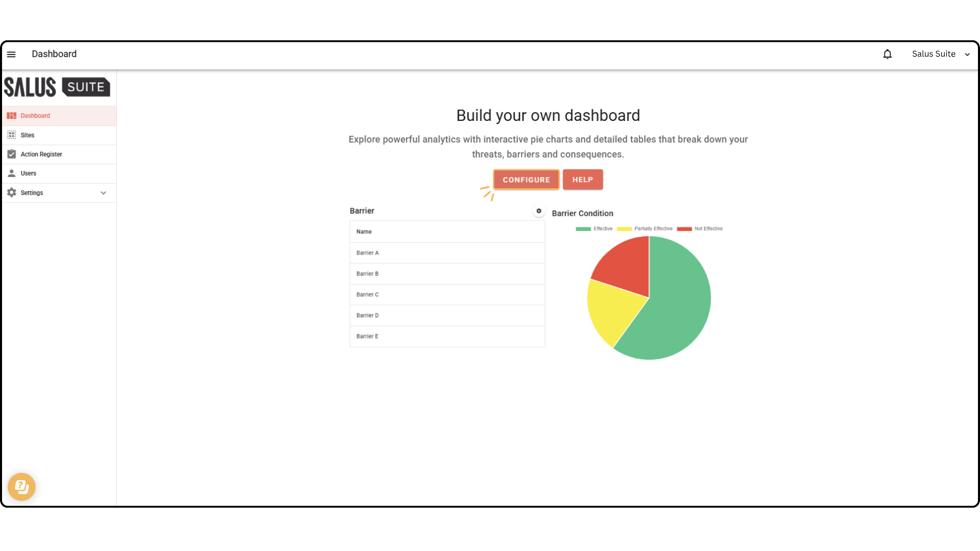
Build your dashboard
The Salus Suite dashboard lets you compare data across multiple diagrams and projects. Each user’s dashboard view is unique to their account and customisable. Every element is drag and drop, so you can change the layout to suit you.
Step 1: Go to the Dashboard menu.
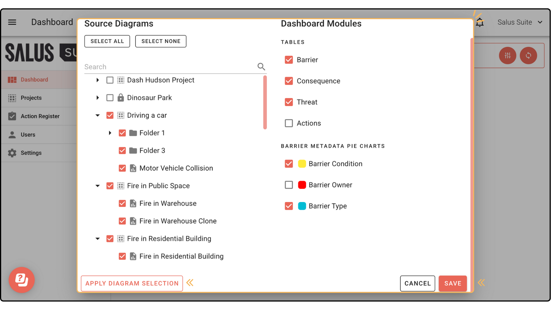
Step 2: Click CONFIGURE.
Step 3: In the pop-up, select whole projects or individual diagrams to analyse and click APPLY DIAGRAM SELECTION. Choose which elements to display in table format, and which metadata to show in pie charts, then click SAVE.
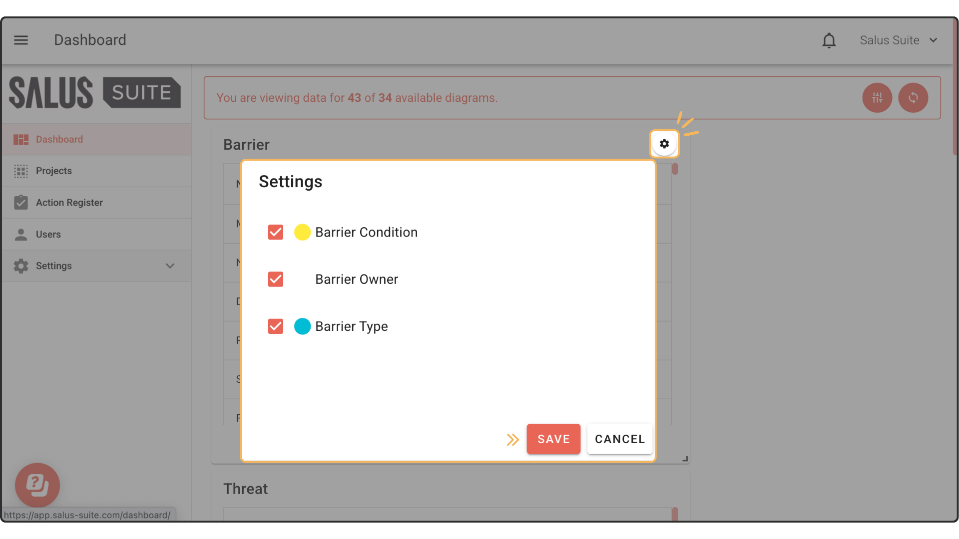
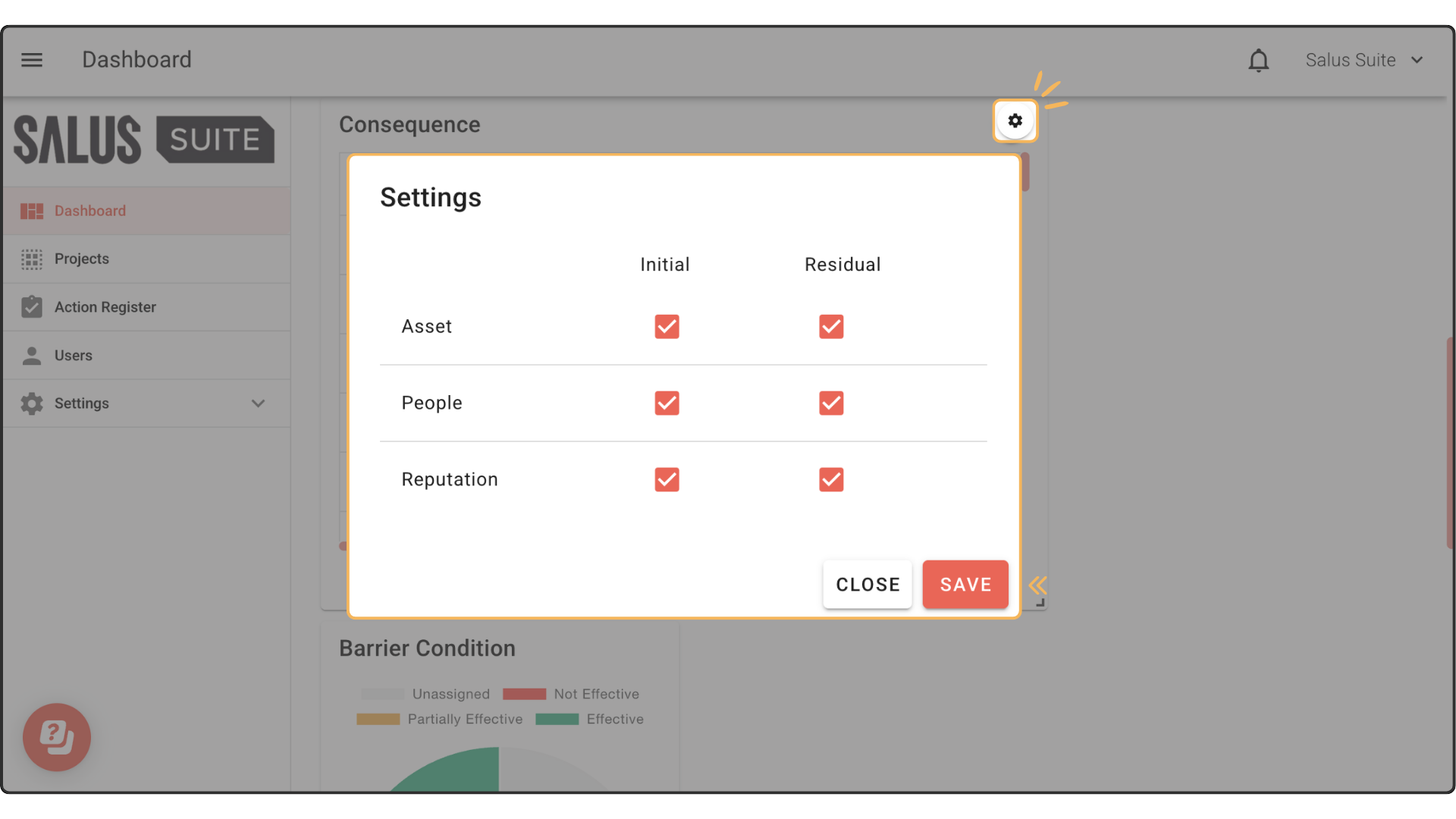
To display metadata and risk matrix values in the tables, click the gear icon at the top right of each table (Barrier and Consequence) and select what you want to see.
For deeper analysis, connect your dashboard to external software such as Power BI. See the API documentation for more.